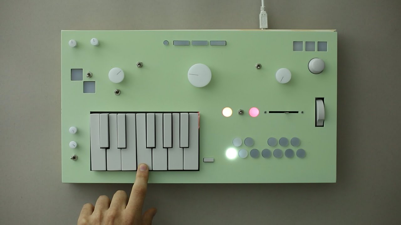
I love the dual bass note concept and the chord extensions, thought the latter is a bit like the KordBot.
Also check out Martin Grieco’s Youtube Channel !!!
Twelve good videos.
He also has done a three fader, ambient sort of creation performance.
And he is also a great bass/ guitar performer in a range of styles, and has some good performers along too.
Wish the chord buttons and the mod wheel were on the left side of the keys
This looks fun to play with and you could probably get some cool performances out of it, but: it also seems like a rather complex and opinionated interface for avoiding learning to play basic harmonies on a keyboard.
This looks great. The bass pads intrigue me, I hope it does well.
Learn one thing to avoid learning another. I’m happy for more people to have access via shortcuts if it brings them joy.
So basically it’s harmonized mellotron?
What a gorgeous device! And it’s a prototype!
Love the looks of the Nopia as well.
If he starts a crowdfunding campaign I’d back it even if it takes 4 years, like the Osmose. 
We’ve seen other chord oriented MIDI controllers out there. Maybe one or more of them have more features than this one. But none of them have the visual aesthetics that appeal to me like the Nopia.
i really love the concept. i used various max for live devices that does similar things, a hardware that sort of does similar stuff sounds really cool!
Also, Hecho en Buenos Aires, a good contribution to geographical diversity of gear. 
Looks cool. Nice choices of sounds. I hope they change the chord shaper knob to something more defined and with visual feedback.
Don’t need but want very much
i’m all for minimalist design and whatnot but literally just a single USB port? c’mon . . .
I think he said it’s a prototype. Not only that, it’s the first prototype.
If/when the crowdfunding starts we should have our opportunities to sound off on what USB ports we want on it, what visual feedback we want, threaten to make fun of his mom if MIDI DIN ports are not included, and all that.
Hopefully he won’t chicken out and make the final product boring, black looking thing.
Yep, the Keys look misaligned.
I love the comment reply to the comment about the green color
“Yeah that’s where they screwed up with the DX7.”
He should make “artisanally misaligned keys” a stretch goal or something
I love the idea.
Styled like a Wii Avatar of a synth.

